This site
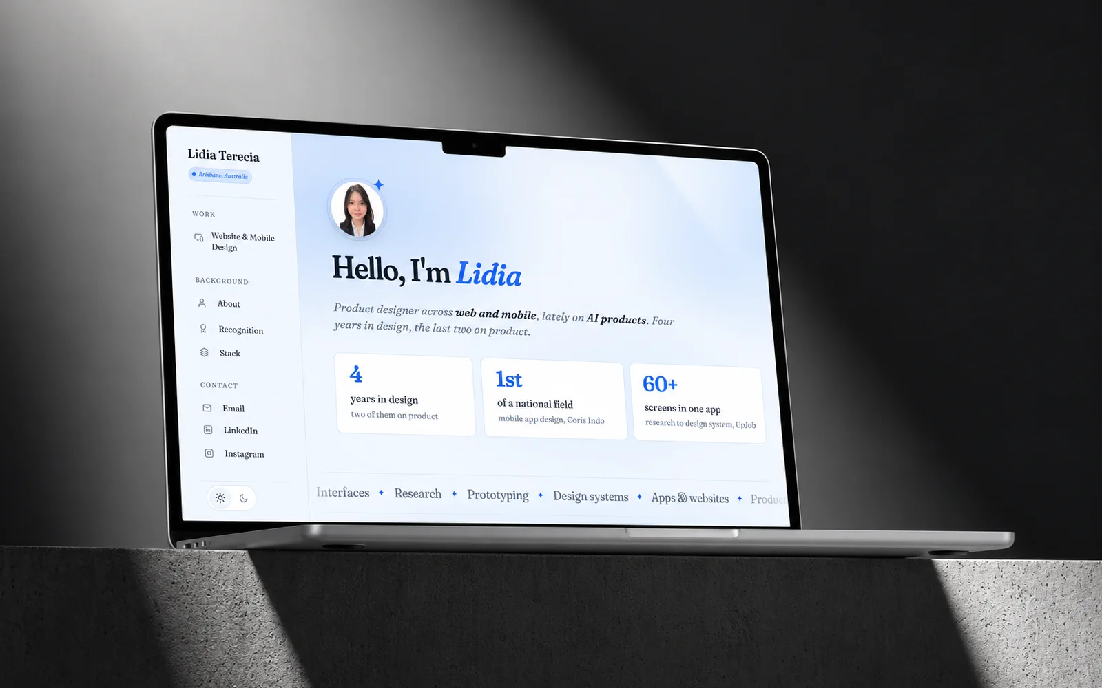
A designer I respect looked at my portfolio and told me something I did not want to hear. Every case study on it carried the same weight, so nothing on the page said which one to read. He was right, and the implication was worse than the observation: a recruiter reads one or two, and mine had quietly handed that choice to a stranger.
What was wrong
The site was not ugly. It was flat. Six projects rendered through one template at one size, each with a screenshot, a name and a sentence, which meant my strongest work and my weakest sat at exactly the same volume. The page had no opinion about itself.
Two more faults came out of the same conversation. The case study images were slides exported at 1200px, dropped into a 46rem reading column and rendered at about 61%, so caption type set at 13px arrived on screen near 8px. The pages carrying the most work were the hardest to read. And a custom cursor had replaced the system pointer with a dot that scaled to nothing over anything clickable, so aiming at a link meant steering by a ring that lagged on purpose.
I had built all three of those. None of them were accidents. They were decisions I had made and never tested against a reader.
The system I built first
I stopped redesigning pages and built the parts instead. Everything below lives in one file, tokens.css, and every rule on the site draws from it. The specimens here are painted with those same values, so this is the system rather than a picture of it.
One family, seven sizes
Fraunces, a variable serif, used at four optical sizes. The scale is fluid: every step is a clamp, so it grows with the viewport instead of jumping at breakpoints. Seven sizes cover the whole site. An audit of the stylesheet found thirteen before I folded away the six that had no reason to exist.
- Aa --step-4 page title
- Aa --step-3 section
- Aa --step-2 subhead
- Aa --step-1 card headline
- Aa --step-0 body
- Aa --step--1 caption
Colour declared in pairs
Every colour is declared twice, once for light and once for dark, and nothing on the site names a colour directly. The accent is the only saturated value in the palette, which is why a single blue chip reads as a result rather than as decoration. Contrast was measured rather than assumed: the accent clears 5.17:1 on white.
- Page --bg
- Surface --surface
- Accent --accent
- Ink --text
- Muted --text-muted
- Rule --rule
One spacing scale
Nine steps, with corner radii drawn from the same set, so a card and the text inside it breathe and round on one rhythm. When a value is not on the scale it is usually a sign the layout is wrong rather than the number.
- --space-1
- --space-2
- --space-3
- --space-4
- --space-5
- --space-6
- --space-7
- --space-8
- --space-9
The window, and the star
Every project screen sits in a panel with a title bar and three dots. It earns its place: a screenshot floating on a page reads as a stray asset, and the same screenshot inside a window reads as a product someone can open. The four point star that breaks the sections is the other half of the motif, and it marks the selected row in the rail, so the mark means one thing everywhere it appears.
What I changed
Ranked the work instead of resizing it
My first attempt gave the strongest project a double width card. It fixed the ranking and broke the grid, because one card at double size leaves the space beside it empty, and that reads as a mistake rather than as emphasis. So the ranking moved out of the sizing and into the order and the copy. Every card is the same size now. The work worth reading first is simply first, and each card opens with the result rather than with a product name the reader has never met.
Named how much there is to read
Two case studies carry thirty odd screens of process. One carries eleven. Labelling them "View case study" and "View overview" costs a word and stops the short one reading as a broken version of the long ones. Three projects came off the site entirely, which was the same judgement applied honestly.
Let the images leave the reading column
Prose keeps its measure because line length matters there. Images do not need it. Case study figures break out to 1088px and covers to 1240px, so a slide renders near the size it was drawn at. The award certificates went the other way, down to a 272px thumbnail, because a certificate is evidence for a claim and not the claim itself.
Stopped the page moving under the pointer
The custom cursor went, and with it a name that inflated and burst on hover, words that lifted as the pointer crossed them, and a background that leaned toward the mouse. Hover feedback stayed, but only where it is attached to the thing being pointed at, and only where it settles. Nothing moves the target any more.
How it is built
Plain HTML, CSS and vanilla JavaScript. No framework and no build step, so the files that ship are the files I edit, and the site opens from disk by double clicking index.html.
What would otherwise be copy and paste is generated instead. Small Node scripts own the repeated blocks: the work cards, the hero figures, the rail, the design process, and the fold that pulls About, Recognition and Stack into the home page. Each one writes the English and the Chinese tree from a single source, so twenty five pages cannot drift apart while I am not looking.
One script exists only to catch me. It walks every page for broken internal links, images that do not match their declared size, leftover placeholder copy, missing alt text and stale cache hashes, and it exits non zero when it finds any. It caught a dead link twice during this rebuild, both times after I had already decided the work was finished.
What I would change
The hierarchy is an argument I made, not one I have tested. I know the flat version failed for one experienced reviewer. I do not yet know that this version works for a recruiter with thirty seconds and no reason to be generous. That is the next thing to find out, and it needs people rather than another revision.
Next
LexAI →